FAQ
FAQ (Frequently Asked Questions) empowers customers to self-serve, enabling them to find solutions quickly on their own.

FAQ Element allows you to add to your funnel a list of answers or information to typical questions/concerns your customers might have related to your business/services.
Text Format

You can edit your texts using these text formats here;
- Bold
****When you click on this format, it allows you to bold your highlighted text. - Italic
This format allows you to slant your text. - Strike
This format allows you to cross/strike your text. - Underline
You can underline your text by clicking on the format. - Link
When you click on this format, it allows you to add a link to the text you highlighted. You will also decide if you want the link to open on the current window or a new window. - Paragraph
When you click on this button, it changes the font size to the "Normal text" size 11 with an "Arial " font style. - Header 1
Clicking on H1 changes your text font size to a size "23" with a "Roboto" font style and bold format. - Header 2
Clicking on H2 changes your text font size to size "17" with a "Roboto" font style and bold format. - Header 3
Clicking on H3 changes your text font size to a size "13" with a "Roboto" font style and bold format. - Header 4
Clicking on H4 changes your text font size to size "11" with an "Arial" font style and bold format. - Header 5
Clicking on H5 changes your text font size to a size "10" with an "Arial" font style and bold format. - Header 6
Clicking on H6 changes your text font size to a size "9" with a "Roboto" font style and bold format. - Clear Format
****To clear out/delete any of the format choices you made, simply click on this button.
General Settings
Element Name/Title

Here you will see the default name/title of the Edit option you are working on. You can decide to leave at that or rename it.
FAQ Type
Here you can select the type of FAQ you want; how you want the list of your FAQ to look.
Separate

In this type, the lists are separated from each other and have the drop-down button on the right side of each list, away from the list title
Contained

In this type, the lists are not separated from each other and have the drop-down button on the right side of each list, away from the list title
Simple type

In this type, the lists are not separated from each other but have the drop-down button on the left side of each list, before the list title
FAQ List

Here you will be able to edit each of the lists as you desire. When you click on the list you want to work with in the FAQ settings area, it drops down the list's menu in the editor's space for you to work with.
Below are the edits you can make;
Add New List

When you click on the "+" button, it adds a new list for you.
Duplicate Existing List

When you want to duplicate a list you already created, click on the "Copy/Clone" button.
Delete list

You can delete a list by clicking on the "delete" button. When you delete it, the list numbering doesn't re-arrange itself although it doesn't affect anything.
Arrange List

If you want to re-arrange your list, click on the four (4) mini bars on the left side of the list you want to move, then drag and drop the list where you want.
Image Options

In the Image option, you can decide to add an image or disable it by toggling on or off the image button.
Image

When you click on the image icon on the right side of the space provided, it directs you to the storage page where you can upload the image you want to use. Once you've uploaded the image, click on the image, and then click on the "copy to clipboard" icon on the right upper corner of the page, beside the "delete" icon to copy the image URL.
Click on the "Back" button to return to the Editors' page, then paste the URL in the space provided your image will appear on the editor's space.
Advanced Settings
Custom Options:

- Icon (Close)
You can add an icon to your page by simply selecting from the available icon. If you have the desired icon in mind, you can type it into the search bar to narrow down the options. Here the Icon used when the list's drop-down menu is closed is "Chevron-down". - (Open) Icon
You can add an icon to your page by simply selecting from the available icon. If you have the desired icon in mind, you can type it into the search bar to narrow down the options. Here the Icon used when the list's drop-down menu is Open is "Chevron-up". - Position
You can position the icon on either the right or left side of the list. You can only make one choice for all lists. - Line Height 1.5
You increase the height of the Element box by adjusting the size bar. - Expand Multiple Items at the Same Time
When you toggle on this button, it allows your customer/visitors to drop down multiple menus at the same time. If you turn it off, it will only allow them to drop down one at a time; it collapses the previous menu when a new one is clicked on. - Expand / Collapse all Toggle Button
When you toggle this button on, it adds an "Expand/Collapse All" button to the top left corner of the FAQ section. Once they click on the button, it drops down or collapses all list menus at once. - Keep First Content Open on Load
When you toggle on this button, it drops down the first list menu in the FAQ by default when a customer/visitor loads the page. - Show Image As Popup on Click
If you want your image to pop up when it's clicked on, toggle this button on.
Color Options:
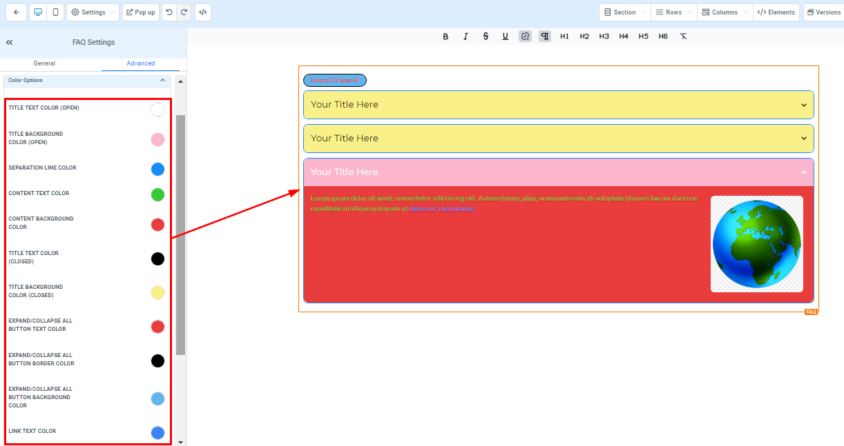
- Title Text Color (Open)
You can edit the color of your Title text which changes the text when the menu drops down. - Title Background Color (Open)
You can also give your Title background a color that changes the background when the menu drops down. - Separation Line Color
Here you can select the color you want for the separation line. You can only choose one color for all lines. - Content Text Color
You can edit the color of your content text here. - Content Background Color
You can also edit the background color of your content here. - Title Text Color (Closed)
You can give your Title text a different color that changes when the drop-down menu collapses. - Title Background Color (Closed)
You can also give your Title background a different color that changes when the drop-down menu collapses. - Expand/Collapse All Button Text Color
For the "Expand/Collapse All" button, you can edit the color here. - Expand/Collapse All Button Border-Color
You can also edit the border color of the "Expand/Collapse All" button. - Expand/Collapse All Button Background Color
Here you can edit the background color for the "Expand/Collapse All" button. - Link Text Color
If you have a link added to this page, you can only edit the link color here
Font Options:
Title and Content Font Family

Here you can edit the font style of your title/content.
Title and Content Font Size

You can adjust the mobile and desktop font sizes of the title/content simply by adjusting the size bars.
Change Mobile Font Size

If you want to adjust the title and content font size for mobile or desktop, just click on this button; click on it once to change to the mobile size and click on it again to return to the desktop size.
Spacing Option:

There are different spacing options available for adjusting your content. Depending on the Edit option you are working on, the settings will only be applicable to that option. For example, if you are editing a particular Row (the BLUE box), only every content in that Row will follow the command of what settings you make.
- Padding Left, Right, Top, and Bottom
This Four (4) different toggle bar moves the content to either the left, right, top, or bottom depending on the toggle bar you click on. - Margin Top and Bottom
You can adjust the top or bottom margin of your content by toggling its bars.
Border And Shadow:
Border Options

Border
****You can choose the type of border you want. Once you select any of the border types, the settings for the border pop up;
Style
****There are three (3) Different styles for your border, It could be a solid, Dashed, or Dotted border.
Width
****When you increase the border width, it increases the thickness of the border.
Color
****To change the color of the border, click on this color icon.
Radius
****Adjusting the radius of your border curves the edges of the border, the higher the number you select, the curvier it becomes.
Radius Edge
****You can decide the corner of the border you want to curve, either all edges, Top only, or Bottom edge only.
Box Shadow

If you want your box to have a shadow, simply select how strong or light you want the shadow to be.
Visibility & Custom Class:
Visibility

You can decide if you want this particular Edit option to be visible on only mobile devices, desktops, or both by clicking on it to highlight the icon.
Custom Class
Input your custom class here.

CSS Selector
If you need to copy the Custom CSS, just click on the "Copy" icon on the right side of the reference code.

Was this article helpful?
That’s Great!
Thank you for your feedback
Sorry! We couldn't be helpful
Thank you for your feedback
Feedback sent
We appreciate your effort and will try to fix the article